TomTom · 2025 · Design Systems, Mobile, AI
Unifying mobile navigation: consolidating three apps into one flagship product
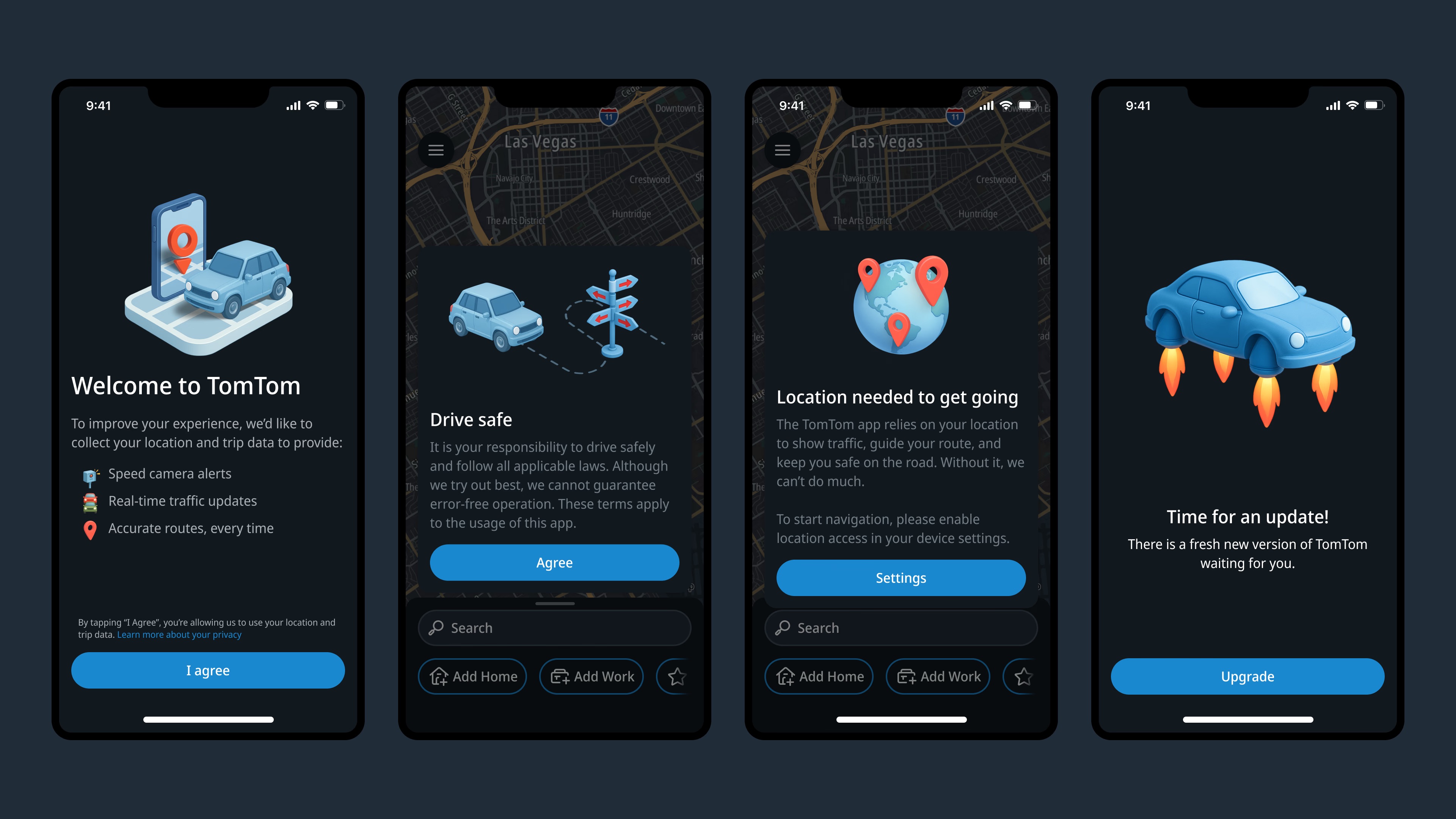
TomTom was running several mobile apps built on different UI foundations, none aligned with the newer Automotive product. Leadership wanted one flagship mobile experience that shared visual and interaction DNA with automotive — without losing the install base built up over years on the old apps.
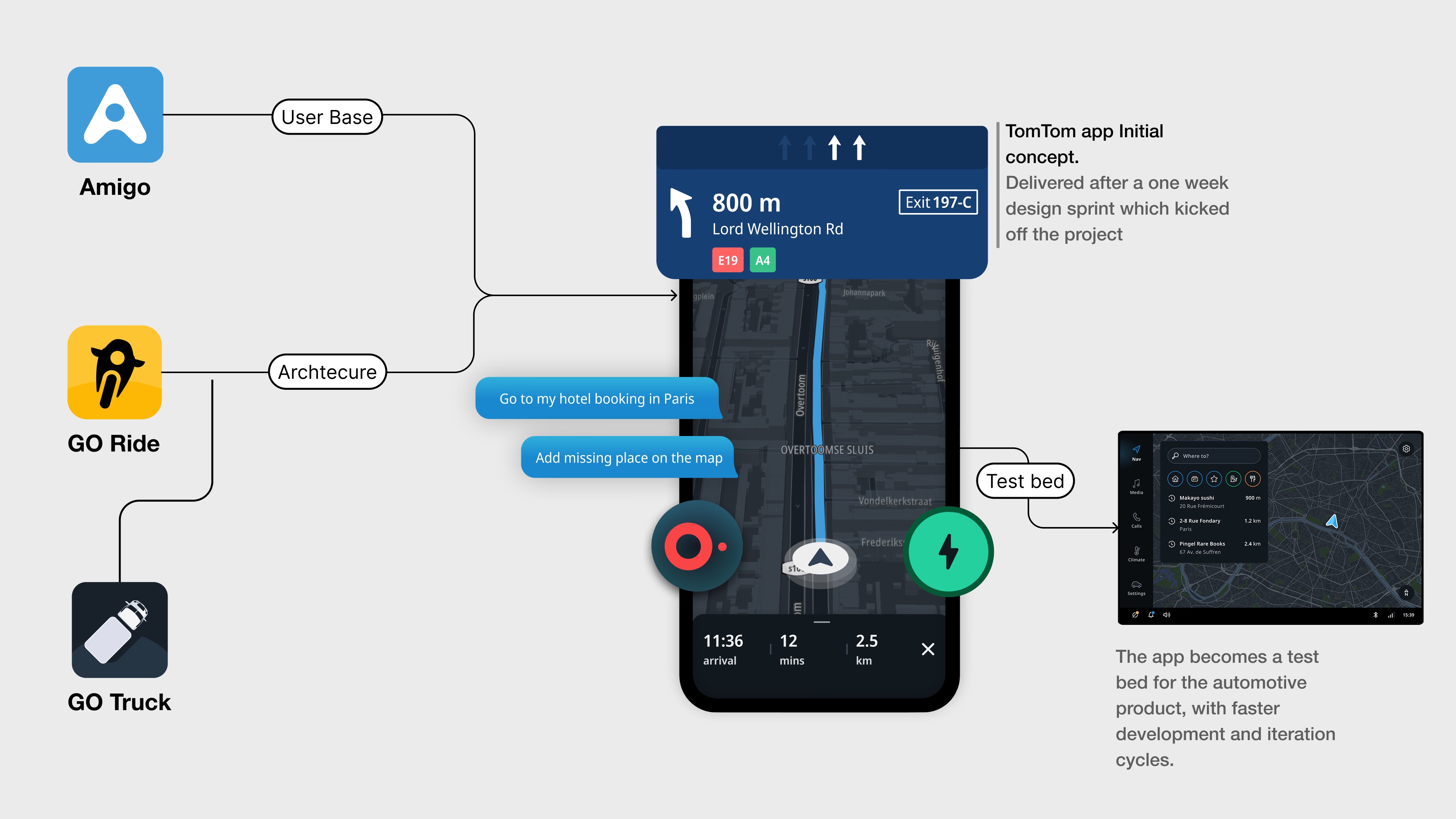
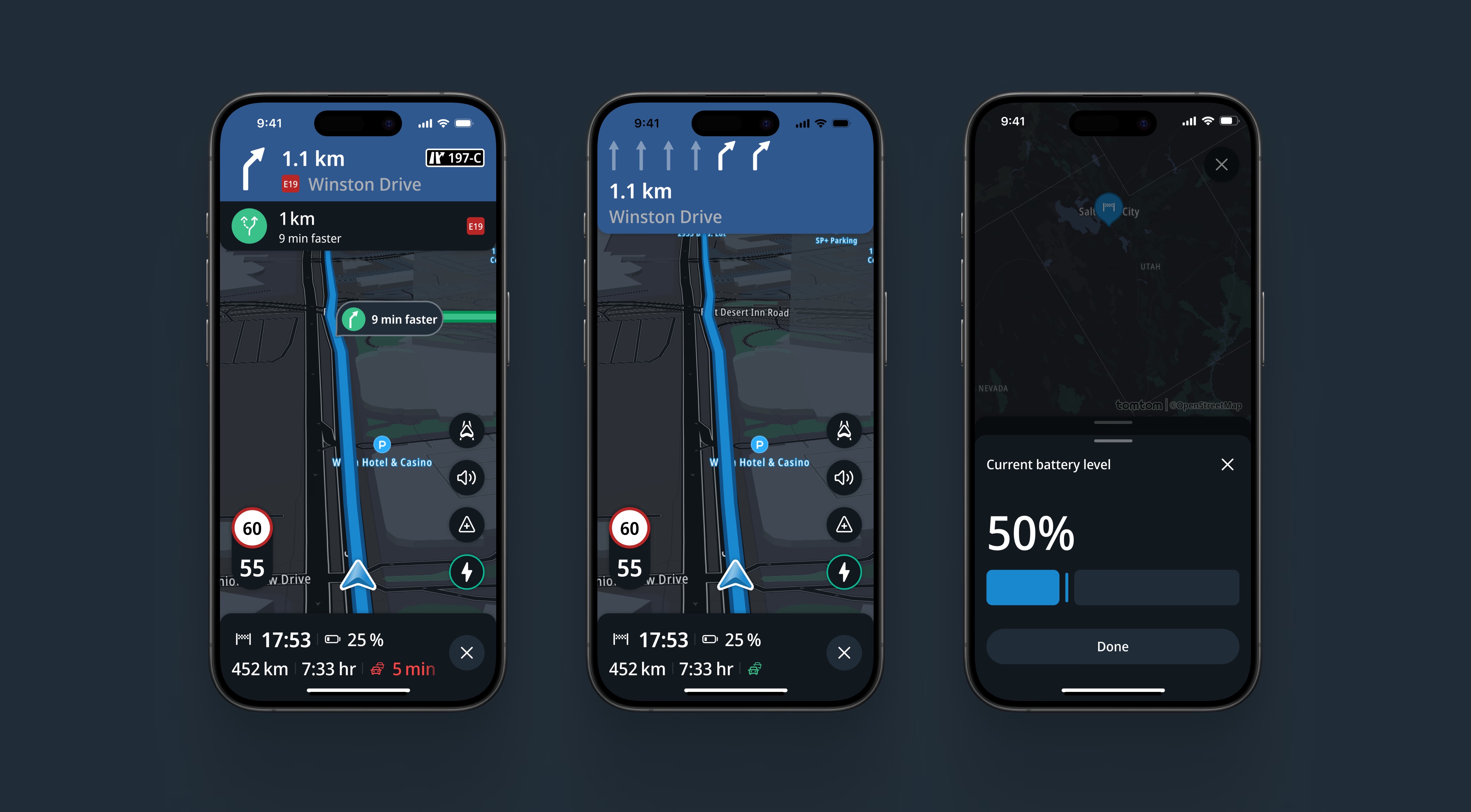
The automotive UX we were asked to align with was defined and designed for large, fixed, in-dash screens with a glance-based interaction model built around safety constraints. Replicating that experience on a phone — a much smaller screen with a completely different interaction model, held in hand instead of mounted in a vehicle — wasn't a straightforward port. What worked at a glance on a 12-inch dashboard display didn't automatically translate to something usable with a thumb on a 6-inch screen.
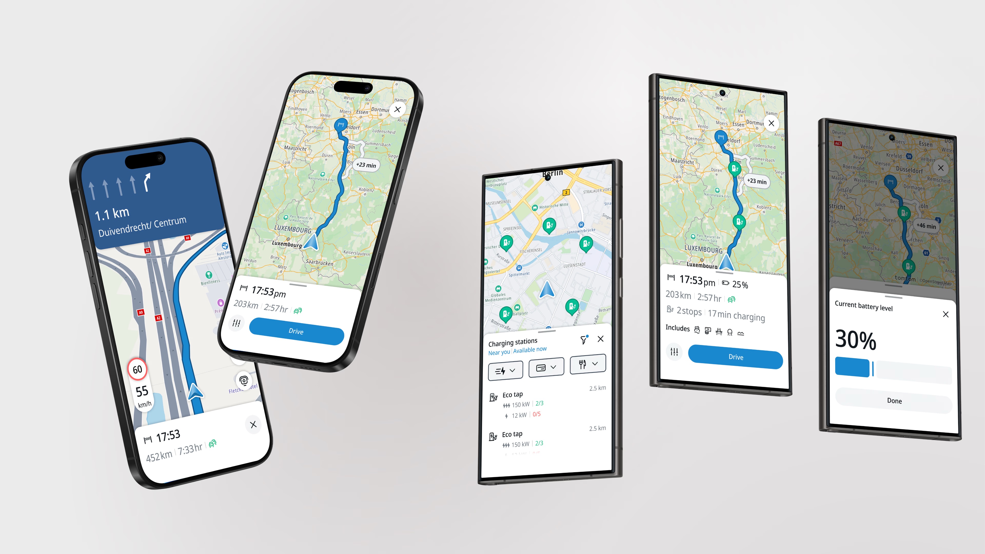
On a tight timeline of 6 months, both design and engineering needed to deliver an internal alpha build that would set the stage for success. Luckily, TomTom AmiGO was an existing mobile app that would be replaced by the new app. This helped speed up delivery time. However, the UI needed a fresh overhaul and since the new app would be built to last, we want to lay a foundation of a solid Design System. The early days would focus on shipping functionality, where visual refinement followed after.
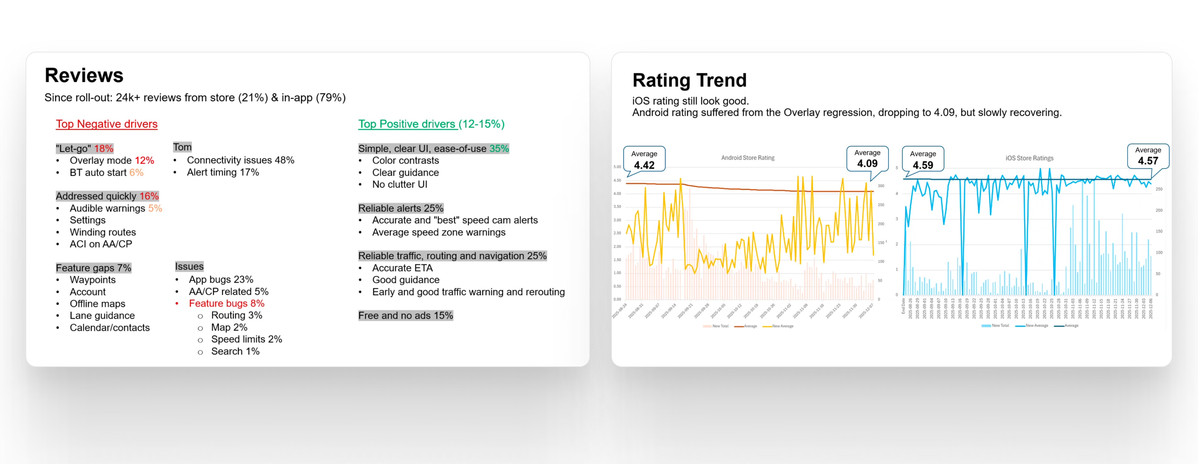
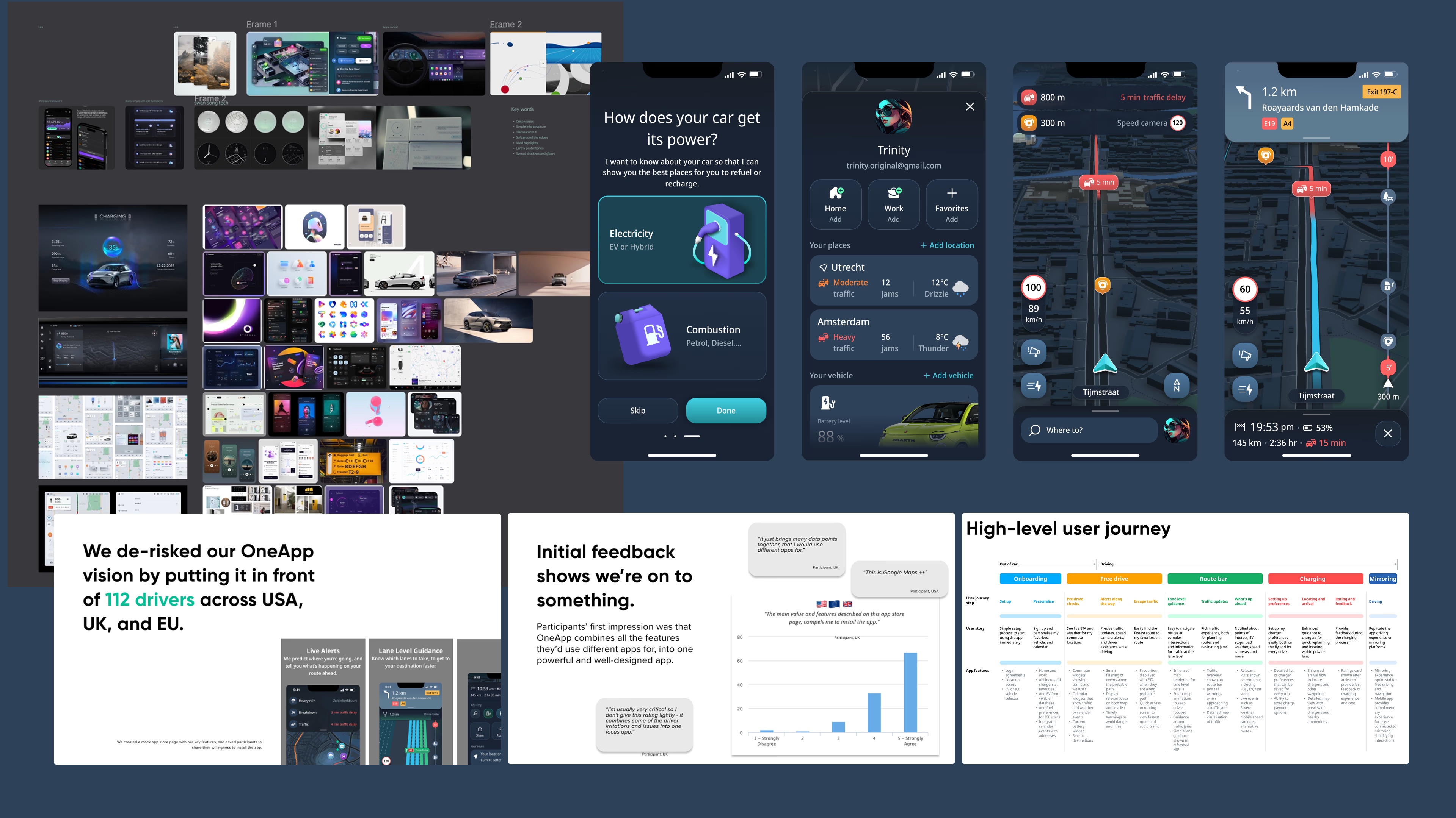
Starting off with validation, we put a vision prototype of the app in front of 112 drivers across USA, UK and EU. The initial feedback showed that the app was valued, the design style was liked and the app overall felt premium. We knew we were onto something.
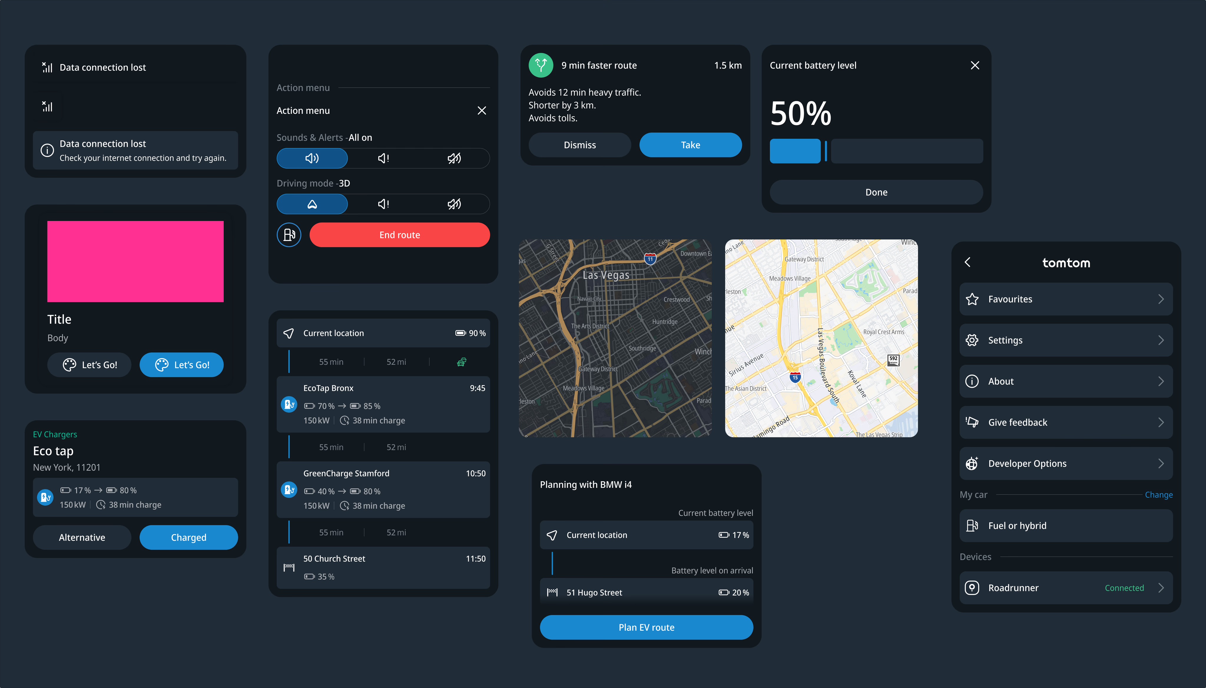
Laying a foundation in the design system was key. The idea of the system was to build it for mobile first and eventually use scalable components that would work for the big screen too - think of built in car screens.
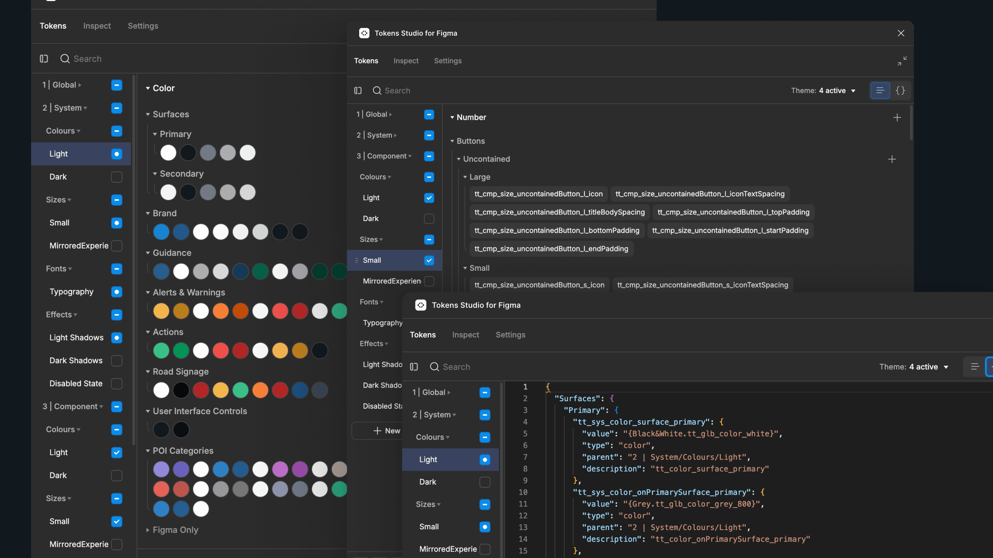
The system architecture we setup followed a three-layer token system: Global - System - Component. This separation would allow for visual changes without breaking component logic or engineering contracts. It allowed designers to move fast and consistent.
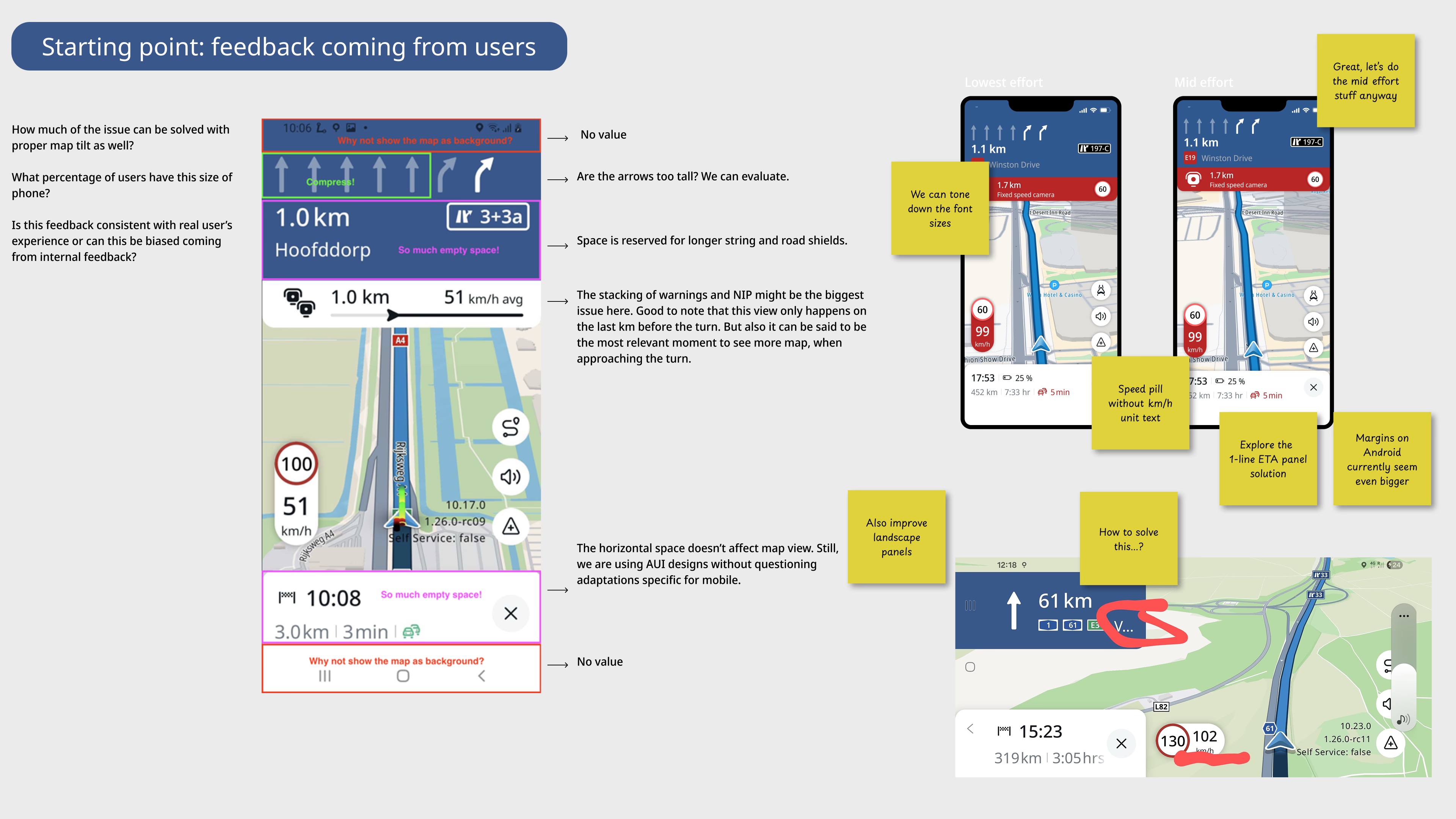
We reached out 6 month goal and launched the internal alpha build. The feedback started to flood in and a lot of it was missing functionality from the previous app that we overwrote. Since we knew features would grow over time, we decided to focus on the visual improvements.
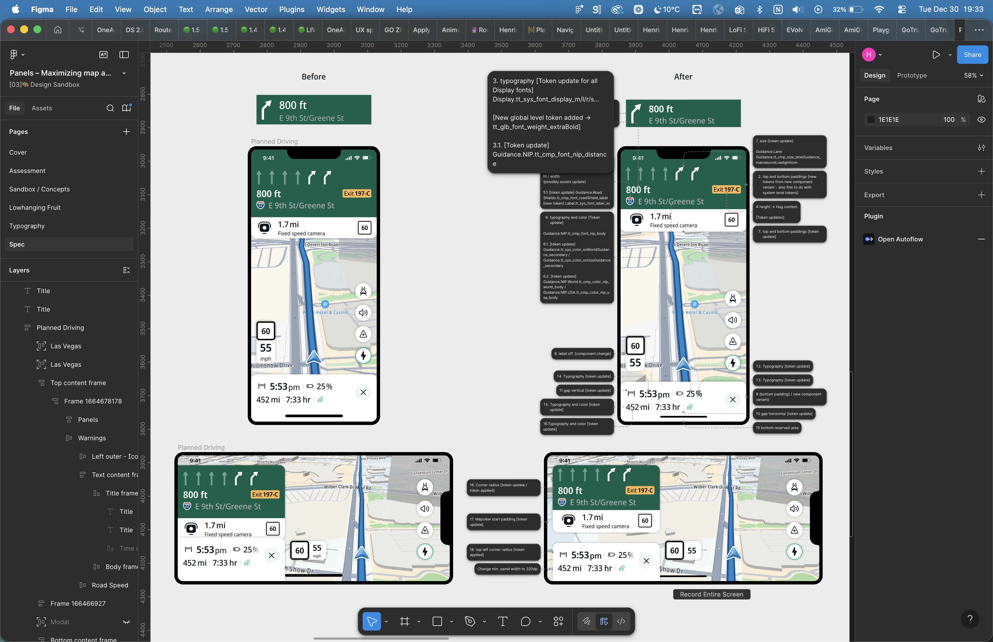
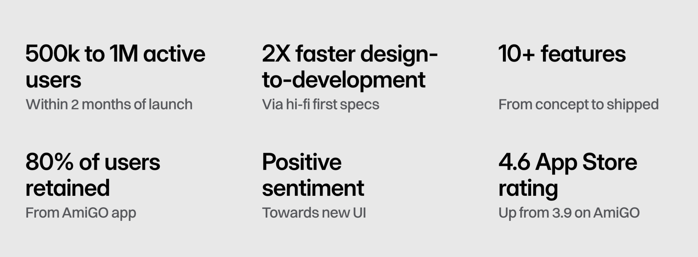
We hit our goal: the app swap went through without losing our loyal user base, and the shared token foundation carried straight into the automotive UI as planned. The user base has kept growing since launch.