TomTom · 2025 · Discover, Optimization, Mobile
EV charger finder: cutting five unknowns down to one confident tap
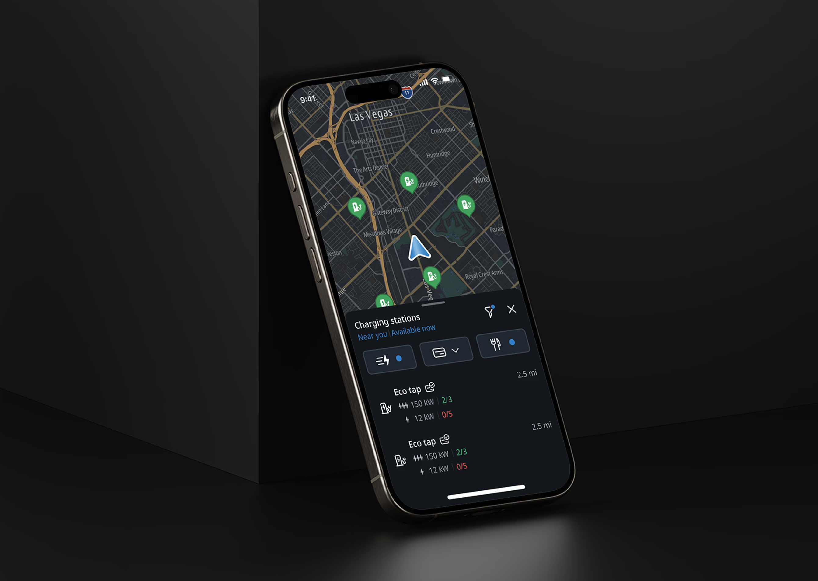
Charging an EV means living with range anxiety and five competing unknowns at once — compatibility, reliability, payment, amenities, and safety. A charging session can run anywhere from a few minutes to an hour, so drivers want the moments before it even starts to be effortless: does this charger work with my car, does it actually work, can I pay this way, is there a bathroom or cafe nearby, is this a safe place to stop? The existing search results treated all five as equally important, which meant showing everything and helping with nothing.
TomTom has invested years of research and SDK functionality into EV charging, shared across both the mobile app and in-vehicle infotainment (IVI) systems. I partnered with a designer on the IVI team so both experiences would align.
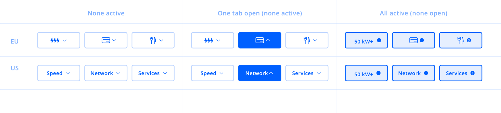
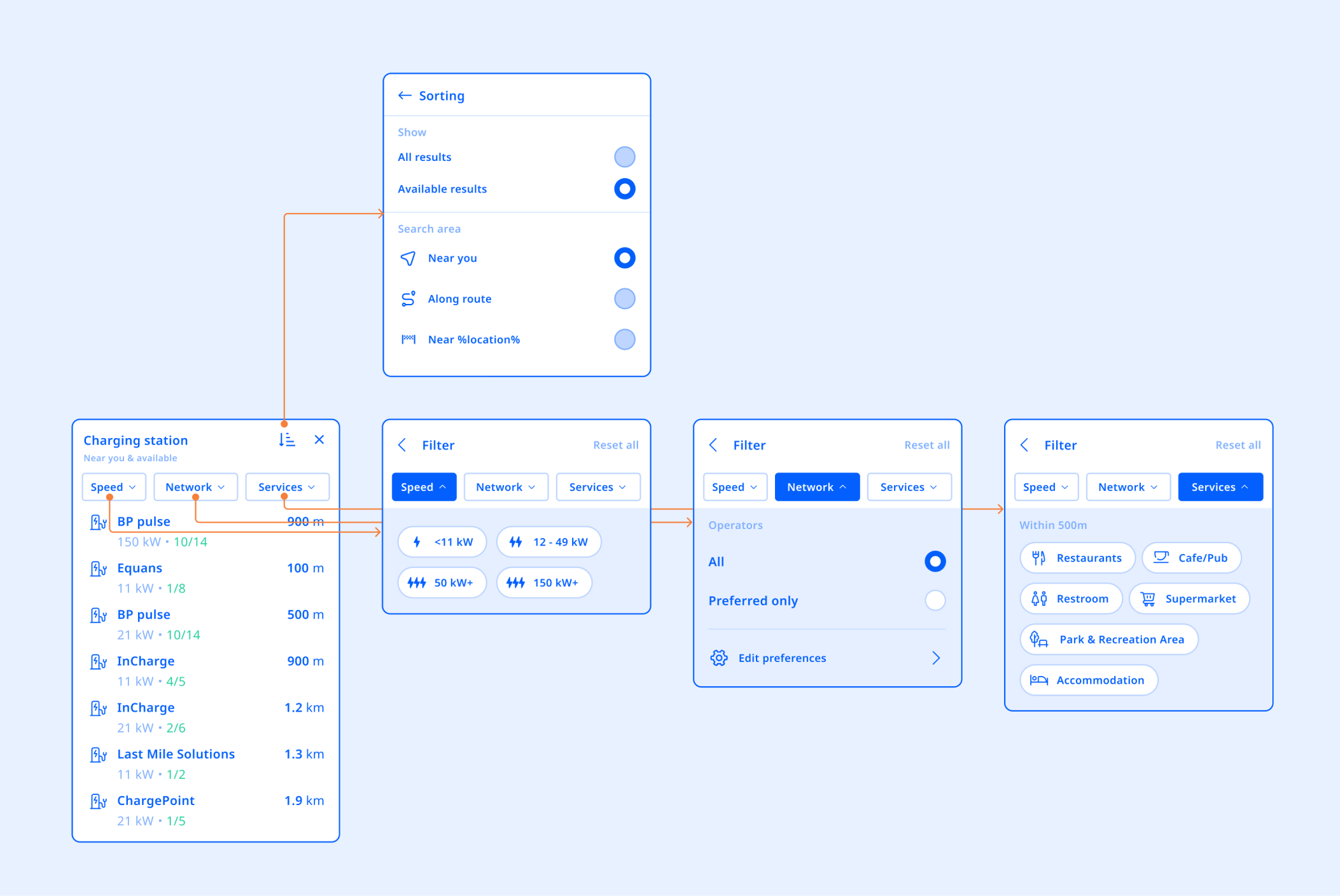
The feature needed enough filtering depth to actually help — charging speed, payment, amenities — without overloading a driver's attention behind the wheel. Our two proposals struck that balance differently, and I wasn't confident either was obviously right based on team conviction alone. Settling it meant testing against a real driving scenario, not just static screens.
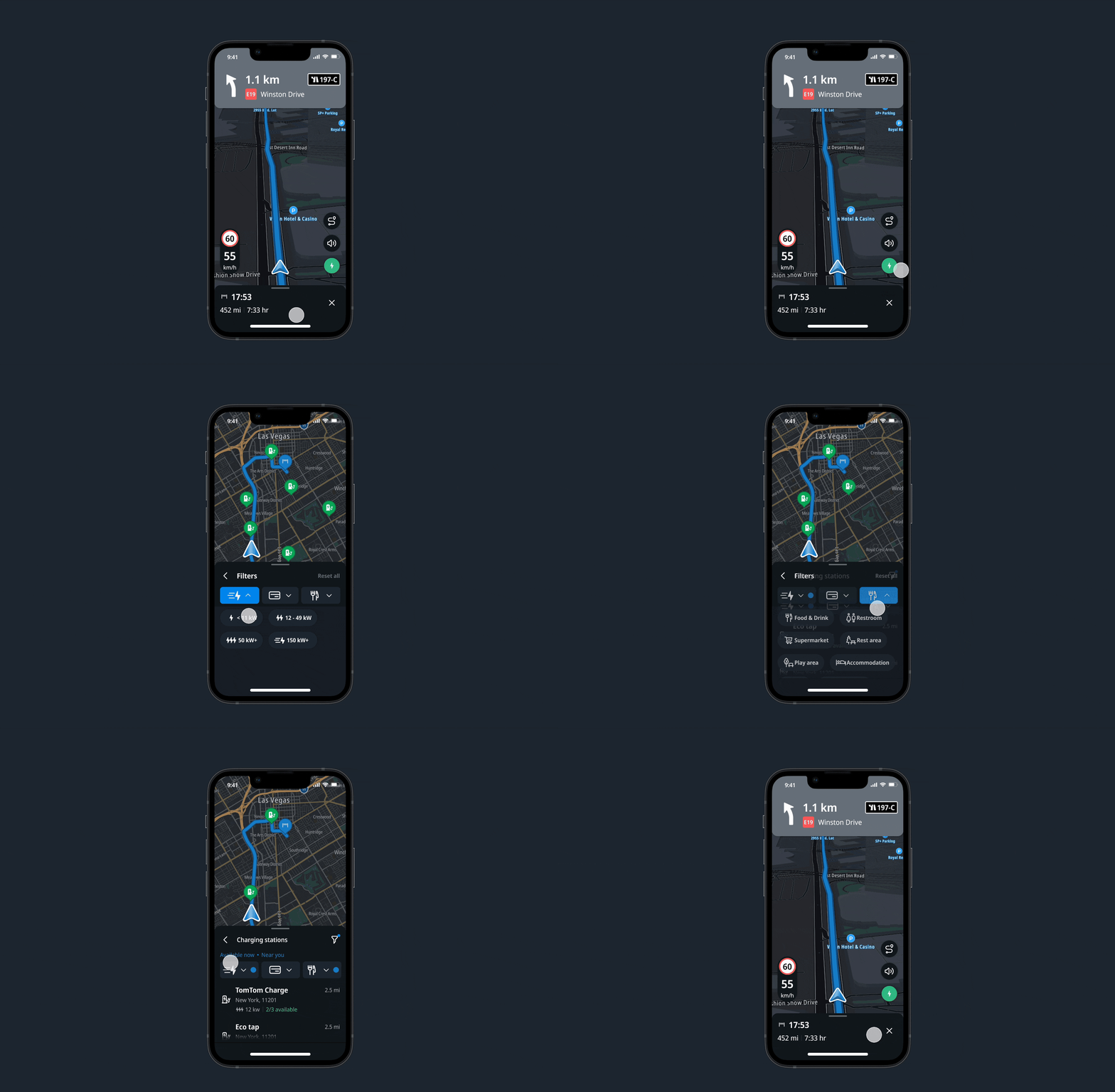
To settle the two proposals, I ran an internal usability test simulating real driving conditions — a steering wheel and dash-cam footage as visual aids — rather than deciding from static screens alone.
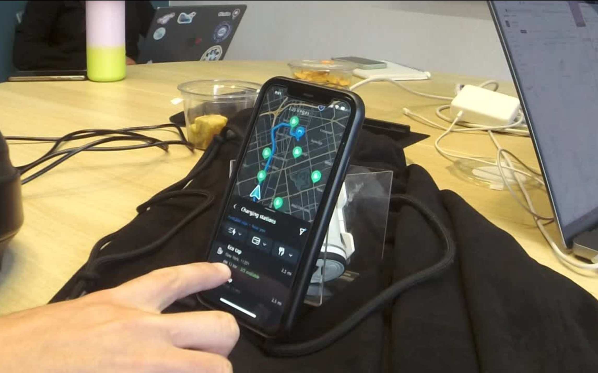
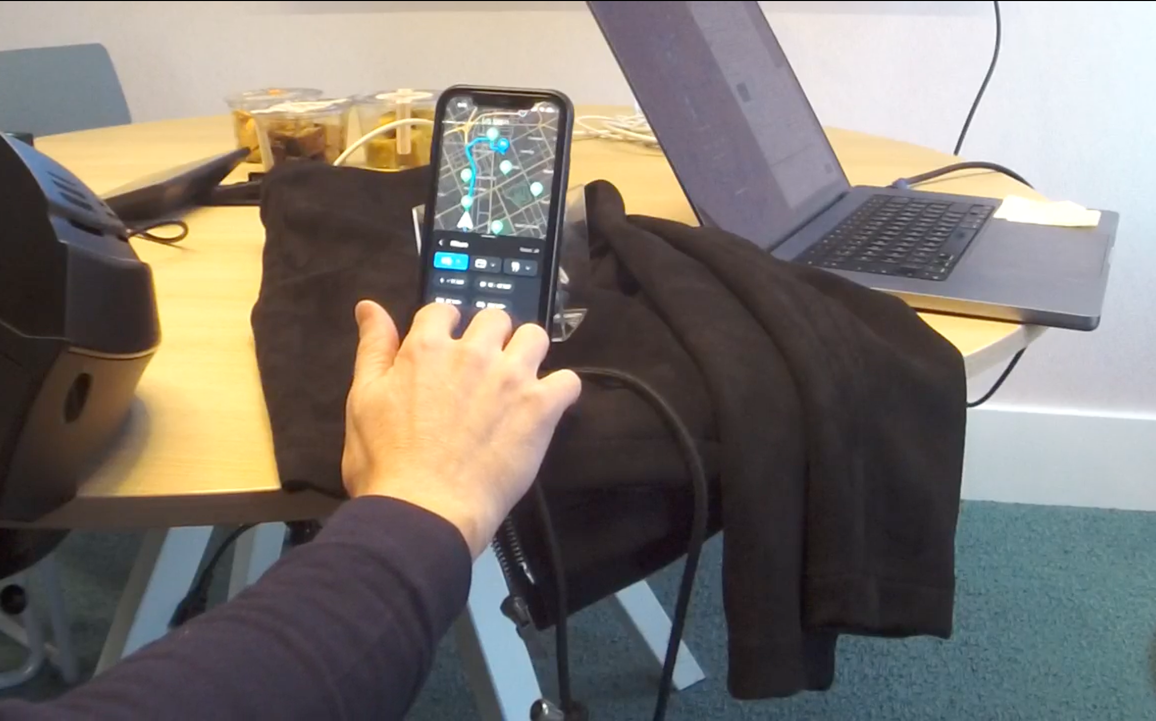
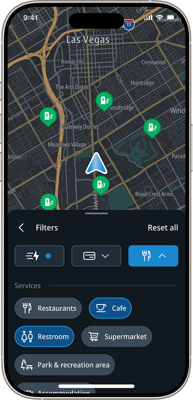
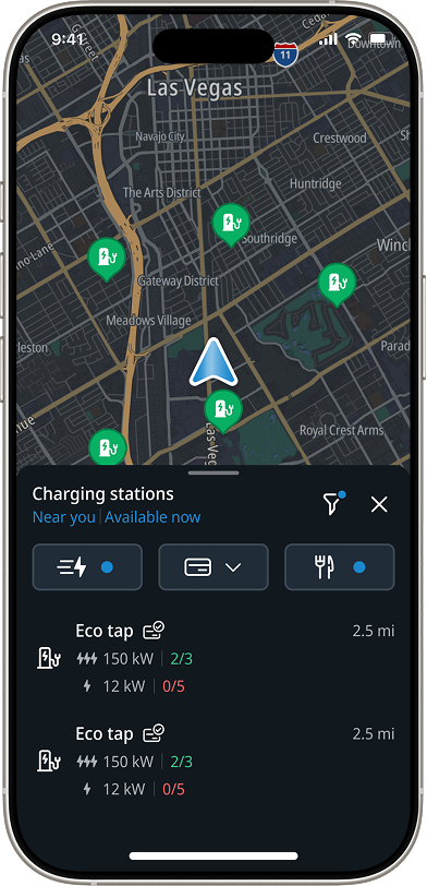
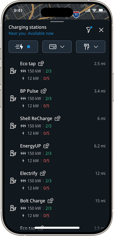
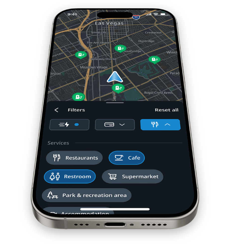
Testing pitted an A and a B version of the filter experience against each other, and A came out the clear winner — drivers navigated and applied it without losing focus on the road. I moved forward with that direction: a charger-finder entry point — a single, always-available button for quick access to search — paired with a filtering layer drivers can use to narrow results by charging speed, accepted payment methods, and nearby amenities. Filters are opt-in rather than upfront: want coffee while you wait, add a cafe filter; in a rush, filter to the fastest speeds; need a bathroom, filter for that.
The finder button and filtering system shipped in the TomTom app, giving drivers a fast path to a charger that actually fits their trip — the right speed, accepted payment, and nearby amenities — without wading through every irrelevant option. Testing confirmed people understood the feature and valued the freedom it gave them. As the underlying search SDK matures, we're extending the same filtering model to cover more signals, like whether a charger is exposed to weather and how safe a neighborhood feels.